This is the second year we have set a project for the BHC School of Design 2nd year students and Stephen Lew. Students were asked to select one of four companies to design an office space, using Entrawood’s Evolution range. They had to consider the company’s employees needs relating to privacy or noise, as well as collaboration and relaxation, making the most of the available space.
We provided them with a CAD drawing of a loft office space. Everyone had to work with the same layout and furniture whilst expressing each company’s unique identity and work culture.
Select one of the following companies:
- Getaway Magazine – Editors, Journalists, Photographers, Admin staff etc. – Reporting on travel destinations and adventure ideas
- Pinterest – Developers, Directors, Admin staff etc. – The most popular platform to share pictures about the things that interest you.
- Takealot.com – Buyers, Customer services, Logistics, Design & IT etc. – Delivering the latest gadgets, goods and inventions in record time
- Food Lover’s Market – Logistics, Buyers, Accounts, HR, cafeteria – They love/supply good, fresh, healthy food/produce.
As part of your office design choose one area (reception, employee communal (relaxation) space or collaboration/meeting area) to fully express/communicate your concept.
Here are a few of the projects we liked (in no particular order) more coming every few days
Click on images to see larger images
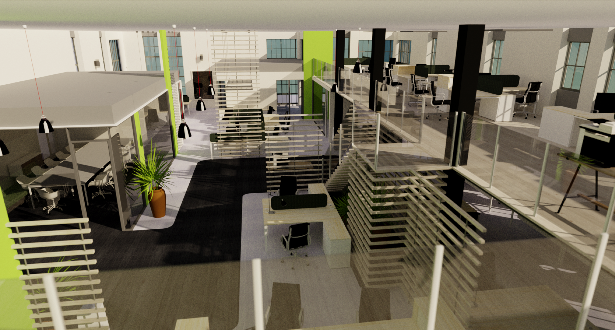
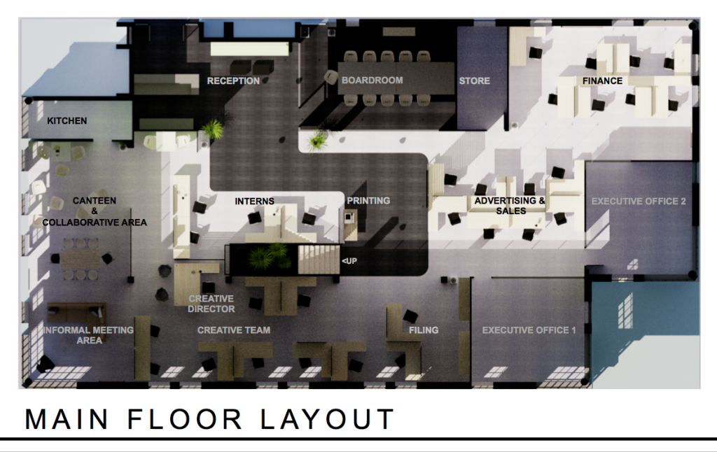
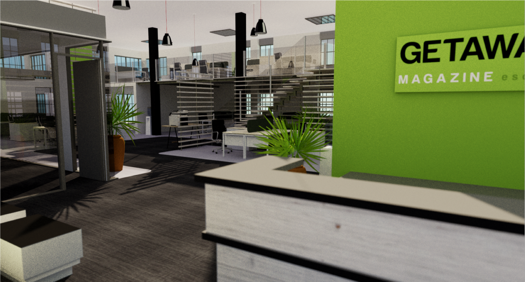
Getaway Magazine – The layout is elegant, the renders a beautiful – this is ready to go to any corporate company for consideration, however it is not clearly Getaway magazine identity
By Frances De Wet
-
- Getaway Mag – Mood
-

- Getaway Mag – Ground Floor
-
- Getaway Mag – Render 2
-
- Getaway Mag – Loft
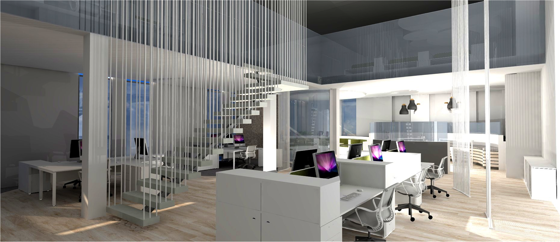
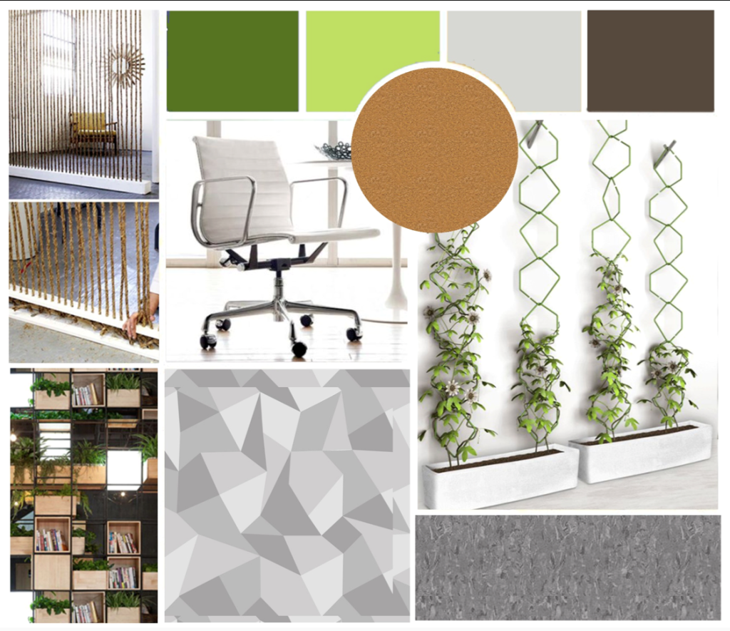
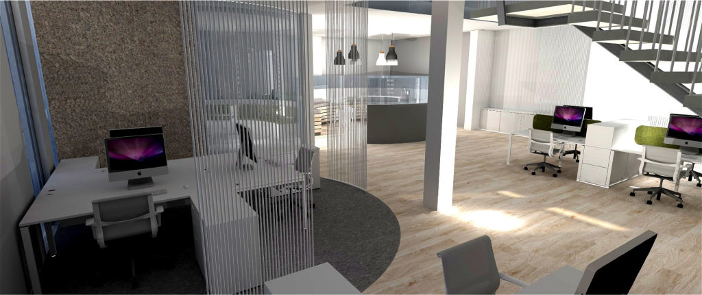
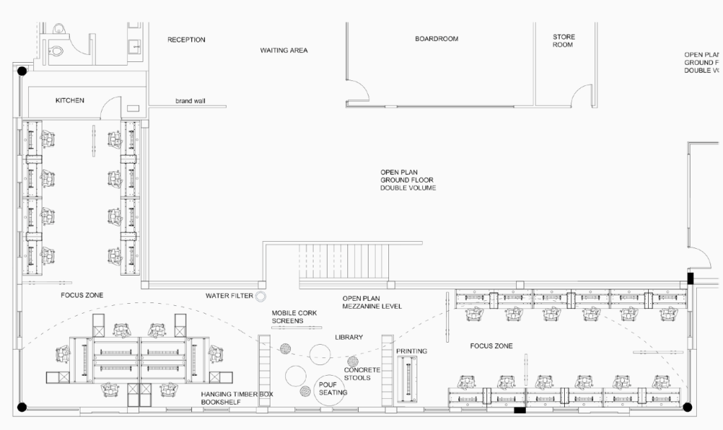
Food Lover’s Market – The client identity and culture is clearly captured. and a beautiful layout/use of space
By Courteney Reitz
-
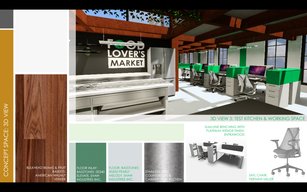
- Food lover’s market – Render 1
-
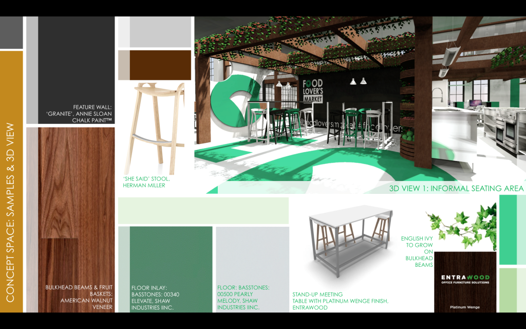
- Food lover’s market – Render 2
-
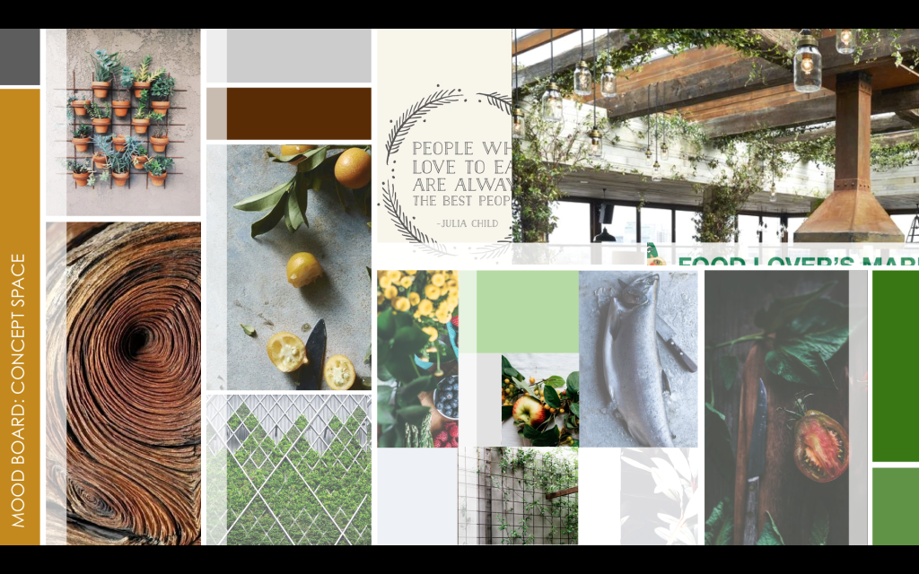
- Food lover’s market – Mood
-
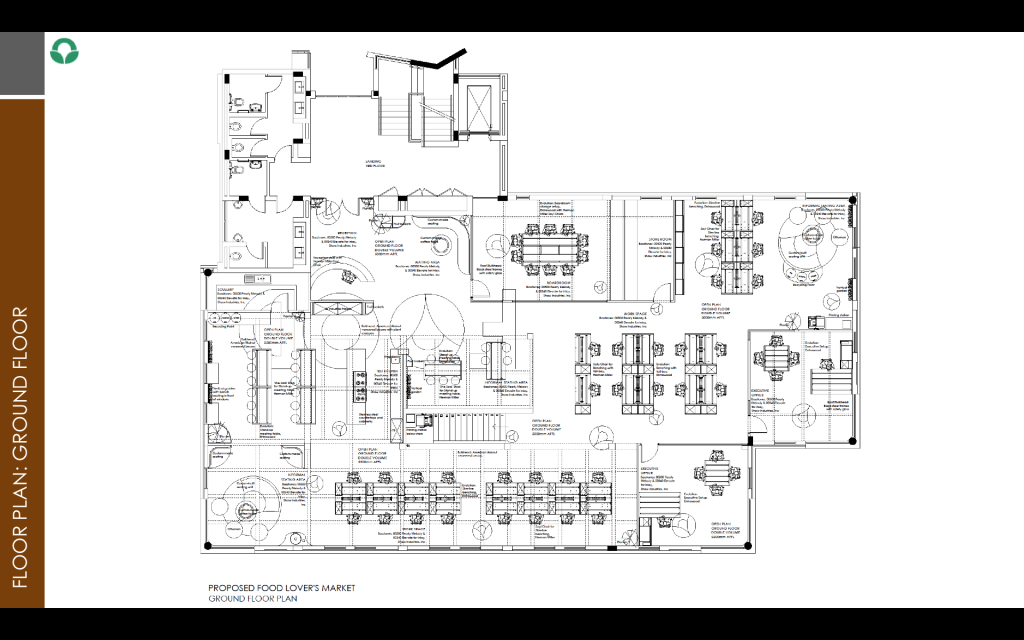
- Food lover’s market – Layout
Pinterest – The client identity and culture is clearly captured. Good quality renders.
See a fly-through of this design Click Here
By Marnich Moller
side view
-

- Moodboard
-
- Layout main floor

-

- Layout loft
-

- Render Office
-

- Render – colab area
-

- Watch Fly Through: https://youtu.be/_uyPKSqUse4
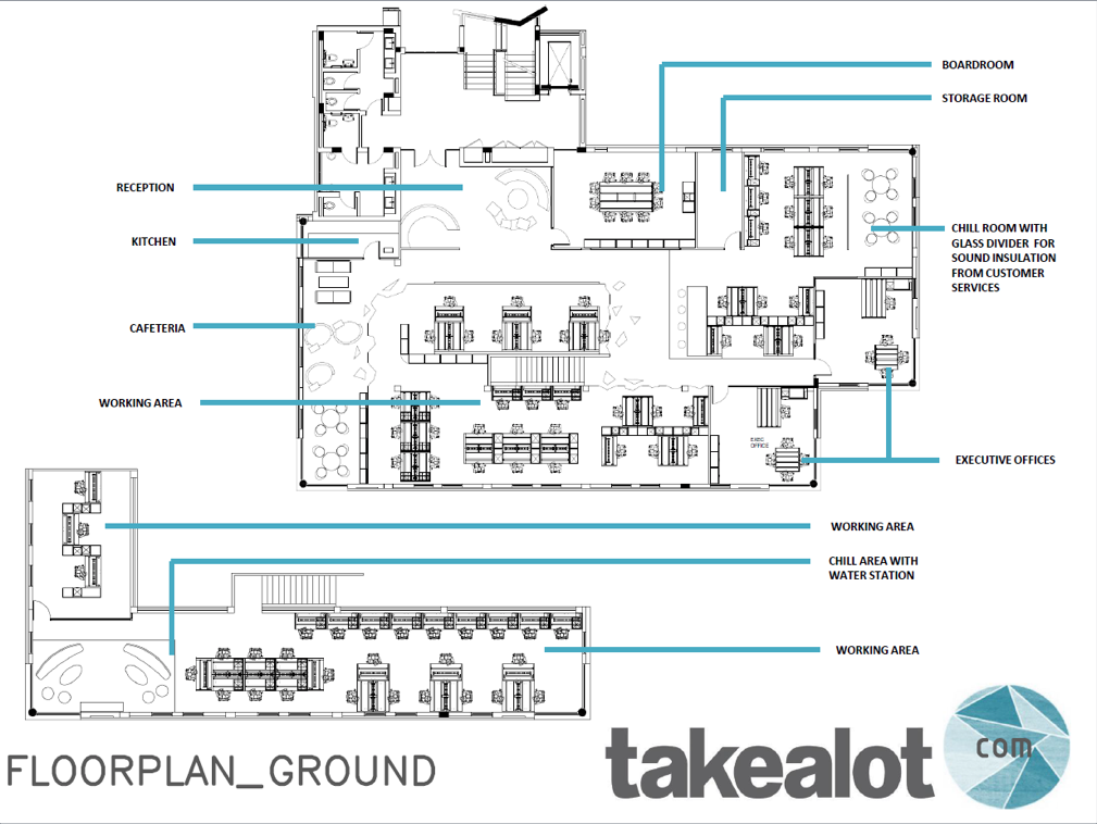
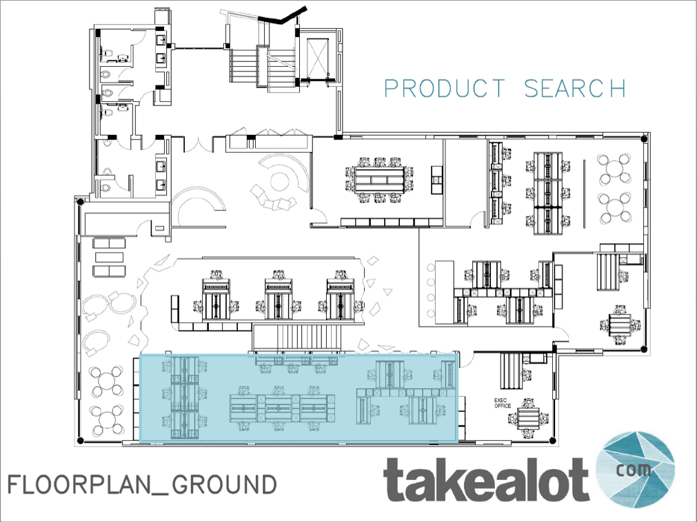
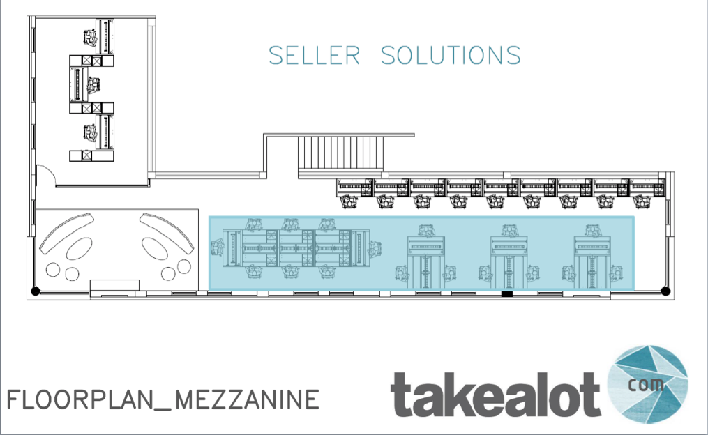
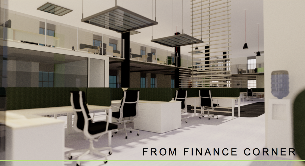
Takealot.com – liked the consideration of space. The logo was adapted slightly to tie in with the style/moodboard
By Anke Van Dyk
-

- Moodboard
-
- Office Plan
-
- Assigned areas main
-
- Assigned areas loft
-

- Render – reception
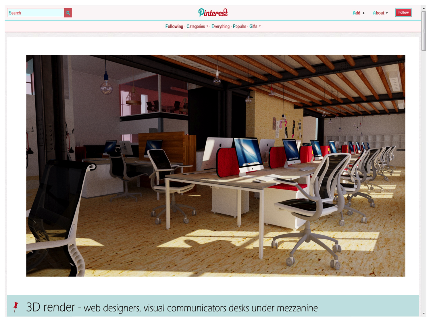
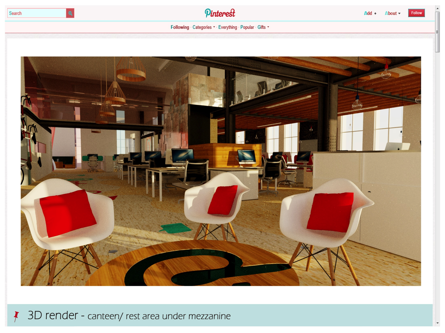
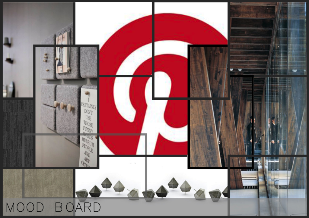
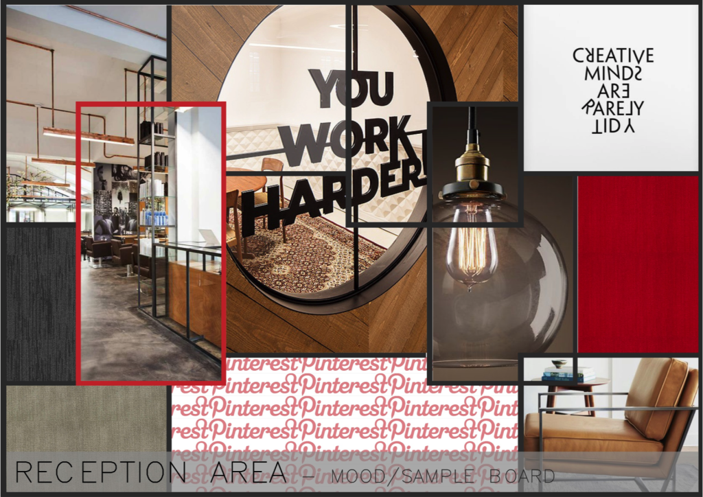
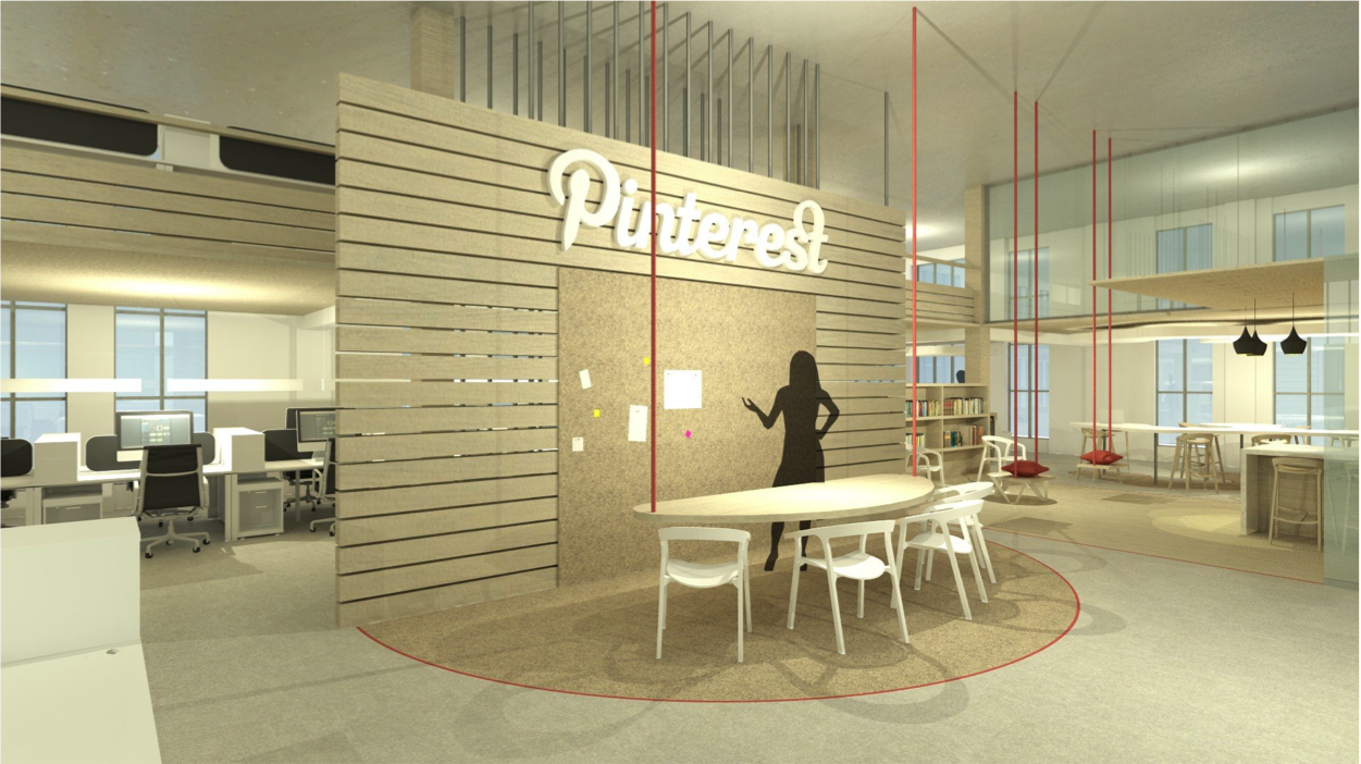
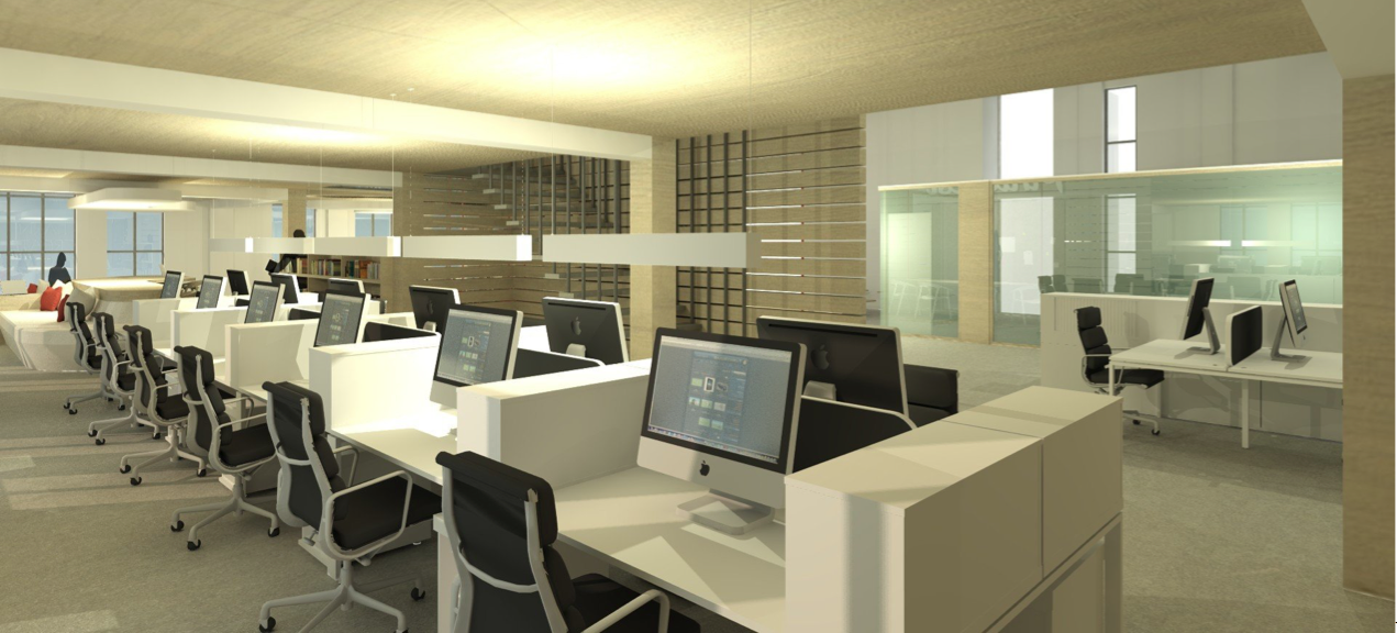
Pinterest – The client identity is well incorporated, the style is very current.
By Erica Bruwer
-
- Pinterest office space
-
- Mood board
-

- Reception
-
- office render
Getaway Magazine – The use of space is considered and used with clear intention
By Seton Escusero
-
- Main Floor
-

- Loft layout
-
- Reception
-
- Render 1
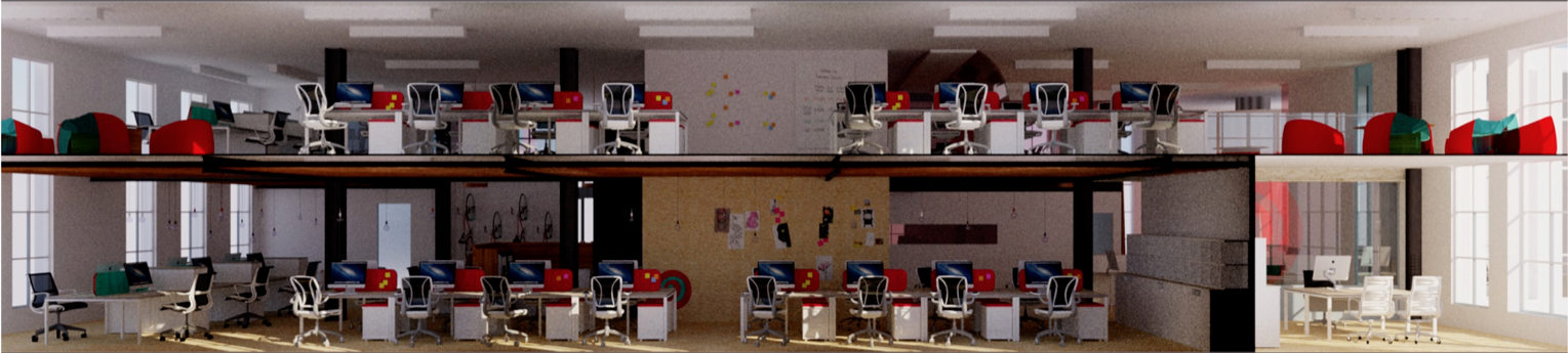
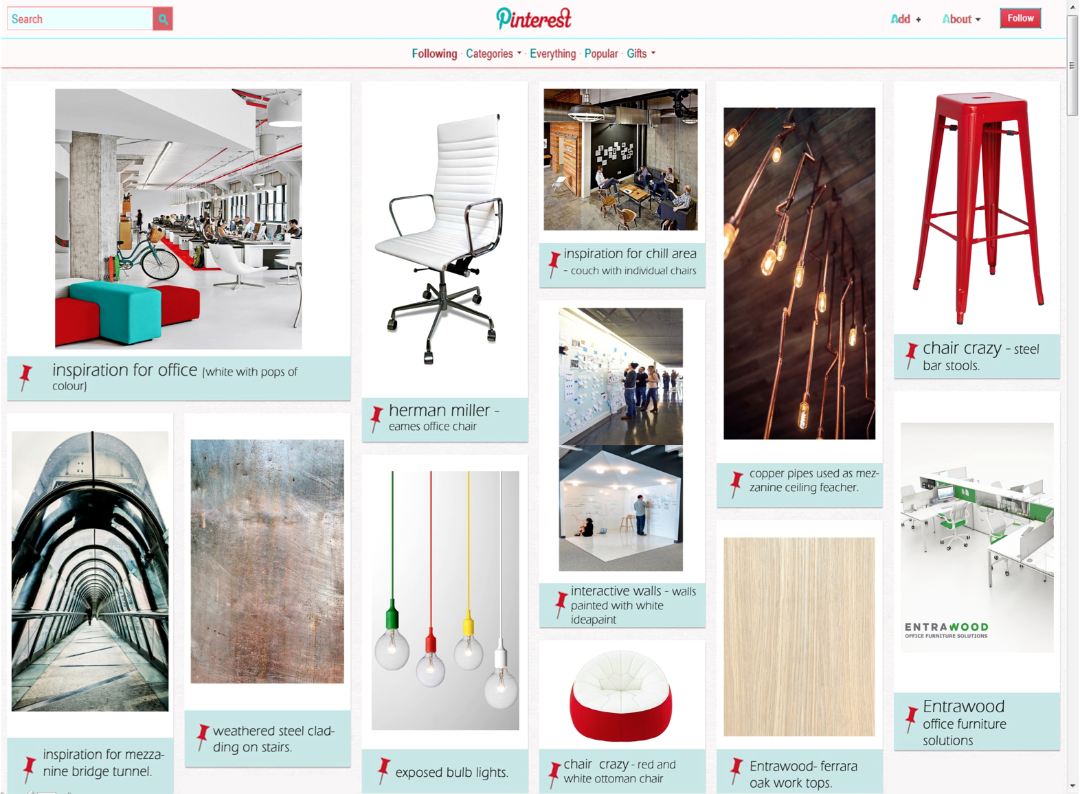
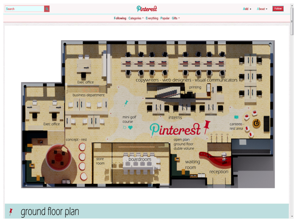
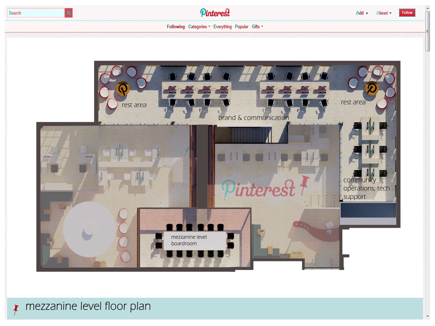
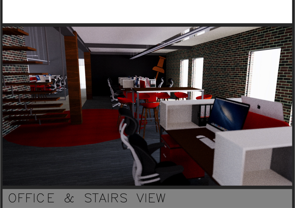
Pinterest – Good layout and flow. Renders were lovely we love the black and white look of the work stations. Pinterest Identity is clear but not too loud.
By James Taylor
-
- Meetings
-
- Workstations


